There is an uneven distribution of climate disadvantaged neighbourhoods across the UK.
On this page:
Previous mapping work conducted between 2010 and 2015 identified a series of geographical patterns associated with socio-spatial vulnerability and climate disadvantage. The work emphasised the heightened vulnerability and disadvantage associated with urban and coastal areas. These patterns are still relevant in the finer-scale work on flood vulnerability and disadvantage published more recently17. However, the revised data provide additional insights, as are outlined in the text below. Furthermore, social vulnerability and disadvantage with respect to flooding have now been analysed in different ways and for different areas. Firstly, social vulnerability to flooding has been analysed in relation to investment in flood defences and development in floodplains. Secondly, findings are reported for urban and rural areas and other useful geographical units, such as ‘cities in decline’. Finally, results are given for future trends in flood disadvantage, including considering the impacts of climate change.
Headlines associated with social vulnerability and climate disadvantage for the UK are shown below. They are grouped into flooding (based on revised data) and high temperatures (based on the original data). The new, finer scale social vulnerability and disadvantage data for flooding are available in our map tool for England, Scotland and Wales. A summary of key findings from the new work on flood disadvantage is available to supplement the materials shown online. The text below has been supplied by the authors of the associated report17 and material is reproduced with their permission. Headlines for social vulnerability and heat disadvantage for England (shown below) are as in the original version of this site. Headlines for the original version of the socio-spatial flood vulnerability and flood disadvantage data are archived separately as are the original maps of socio-spatial flood vulnerability and flood disadvantage.
It is important to remember that the statements relate to relatively broad trends at the national and regional levels. Even in areas that do not have high overall levels of social vulnerability and climate disadvantage there may still be pockets where this is high. In developing local responses to climate-related hazards and climate change adaptation plans it is crucial to identify local patterns of vulnerability and disadvantage. See the map tool to identify the vulnerability and disadvantage in your local area and the information on potential actions (4 and 5 above). The factors associated with the maps are outlined in the User Guide for both flood-related data and heat-related data, with more information given in the explanations in the map tool itself. Further information on key terms and what they mean is given in Section 1, above.
Floodplain population, social vulnerability and exposure to frequent flooding
The most socially vulnerable neighbourhoods are over-represented in areas prone to flooding (all sources), but most significantly in areas prone to coastal (and tidal) flooding. Today approximately 6.4 million people live in flood prone areas, with around 1.5 million (or 23.4% of these people), living in the 20% most vulnerable neighbourhoods. Within all neighbourhoods, 31% (2 million people) are exposed to frequent flooding from either fluvial (river), coastal or surface water sources (with a return period of 1:75 years or more frequent). Of those, 6.1% live within the 5% most flood vulnerable neighbourhoods (ranked in the top 5% by Neighbourhood Vulnerability Index (NFVI), a measure of the propensity of those that live in a neighbourhood to experience a loss of well-being should a flood occur). This is a factor of 1.2 (20%) higher than would be expected (assuming exposure to flooding to be equally distributed between more and less vulnerable neighbourhoods). Of the 1.8 million people living in the coastal floodplain, 33% are within the 20% most vulnerable neighbourhoods and 10% in the 5% most vulnerable neighbourhoods (top 5% by NFVI). This is a significant over-representation. The current distribution of population living on the flood plain is shown in Figure 6.
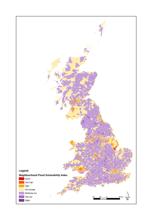
Figure 5: Neighbourhood Flood Vulnerability Index – distribution of social vulnerability to flooding (see the map tool for an interactive version).
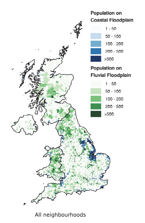
Figure 6: Present day: Concentration of people living in the floodplain17
The proportion of people living in the most socially vulnerable neighbourhoods is much greater in Northern Ireland than elsewhere in the UK. In Northern Ireland 55% of the population exposed to flooding live in the top 20% of neighbourhoods by NFVI (almost double the UK average) and 25% of the total population exposed to frequent flooding are in the 5% most vulnerable neighbourhoods (almost five times the UK average); with the most significant disadvantage seen in Belfast (a finding that also reflects the higher levels of poverty that exist in Northern Ireland compared to other parts of the UK).
Over 50% of those exposed to flooding and living in the most socially vulnerable neighbourhoods are in just ten local authorities. Seventy-five local authorities (approximately one fifth of the UK total) account for 50% of those living in flood prone areas. The concentration becomes more marked when the most vulnerable neighbourhoods (top 5% socially vulnerable by NFVI) are considered, with over 50% of people exposed to flooding in the most vulnerable neighbourhoods located in just ten local authorities (Hull, Boston, Belfast, Birmingham, East Lindsey, Glasgow, Leicester, North East Lincolnshire, Swale District, and Tower Hamlets).
By the 2080s more and less vulnerable neighbourhoods will both experience more frequent floods. The number of people living in flood prone areas is set to increase by 45% to 10.8 million people by the 2080s, assuming high population growth. Combined with a +4oC climate future, and assuming current approaches to adaptation continue, 6.4 million people will be exposed to frequent flooding, up from 2 million today (an increase of over 200%). In the most vulnerable neighbourhoods the increase is equally dramatic, again more than trebling, from 451,000 today to 1.4 million by the 2080s (an increase of over 200%). The greatest increases are experienced in England and in areas prone to surface water and fluvial flooding.
Expected Annual Damage (EAD) and the influence of income and insurance
At a UK scale EAD is dominated by England, but from the perspective of the most vulnerable neighbourhoods the contribution from other nations is greater. Residential EAD from flooding across the UK is £351 million (residential property only). These headline figures also mask the disproportional risks faced by vulnerable communities in all four nations. In England and Northern Ireland, the average EAD per person is highest in the most vulnerable neighbourhoods. The current distribution of EAD is shown in Figure 7 below.
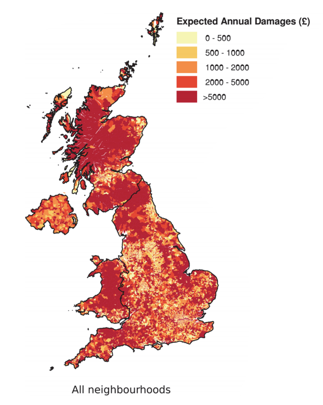
Figure 7: Present day: Spatial distribution of Expected Annual Damages (EAD)17
Today, vulnerable neighbourhoods contribute two-thirds of the EAD in Northern Ireland, but their future contribution raises fastest in Scotland. In Northern Ireland, the 20% most vulnerable neighbourhoods account for 67% of the EAD (in Scotland the equivalent figure is 22%, in England 22% and Wales 26%). This reflects a significant contribution from Belfast. Those living in flood prone areas in Scotland experience the highest EAD per person (on average, £113 per person); this is over double that of England (on average, £50 per person). By the 2080s (assuming a +4oC climate future and high population growth) the EAD per person in Scotland increases to £183 per person (compared to £95 per person in England) with the risk in the most vulnerable neighbourhoods (top 20% by NFVI) increasing twice as quickly as elsewhere (increasing from £93 to £206 per person). This is not the case in England, Wales and Northern Ireland where more and less vulnerable neighbourhoods experience a similar rate of increase in EAD per person.
At the coast, the most vulnerable neighbourhoods experience disproportionally high levels of EAD, today and in the future. At the coast, the 5% most vulnerable neighbourhoods account for 10% of the EAD; the 10% most vulnerable contribute 19% and the 20% most vulnerable 32%. This implies that the risk experienced by the most vulnerable communities is much higher than the average; a disproportionality that persists into the future.
Lower income and lower levels of insurance penetration heighten the ‘relative economic pain’ (REP) of flooding in vulnerable neighbourhoods (across all sources of flooding). Low incomes and low levels of insurance penetration means the REP associated with flooding is much greater in socially vulnerable neighbourhoods than elsewhere. In areas prone to coastal/tidal flooding, for example, the most vulnerable neighbourhoods (top 5% socially vulnerable by NFVI) experience over twice the REP of less vulnerable neighbourhoods; in fluvial floodplains, it is three times higher.
EAD (residential direct damages only) is set to rise, from £351 million today, to £1.1 billion by the 2080s. By the 2080s (under all scenarios) the increase in the EAD metric tranates to significant increases in the REP across the UK and all sources of flooding, particularly for the most vulnerable neighbourhoods.
Urban and rural influences on flood disadvantage
At a UK scale, many socially vulnerable people live in urban areas prone to flooding, however vulnerable people living in rural settings are often exposed to more frequent flooding (and hence, on average, higher levels of EAD per person).People living in more vulnerable neighbourhoods in the fluvial and coastal floodplains are mostly in urban settings (840,000, over 90% of the total 900,000 of the people exposed to flooding in more vulnerable neighbourhoods). The remaining 60,000 in rural settings are exposed to more frequent flooding (reflected in an EAD per person, on average, of £76 compared to £42 in urban settings).
By the 2080s, all neighbourhoods experience significant increases in EAD, with the most vulnerable neighbourhoods in more dispersed settings (both urban and rural) experiencing ightly greater increases than elsewhere. By the 2080s, assuming a continuation of current levels of adaptation, there is a significant increase in risk across all settlement types. In many settings, more and less vulnerable neighbourhoods experience similar increases. In dispersed urban and rural settings however, the most vulnerable neighbourhoods experience ightly higher percentage increases in risk when compared to less vulnerable neighbourhoods.
Local authorities and flood disadvantage
Clusters of high social flood risk exist in local authorities across the UK. The Social Flood Risk Index (SFRI) provides the most direct measure of flood disadvantage (where exposure to flood risk and social vulnerability coincide). It highlights Hull, Boston, Belfast, East Lindsey, Glasgow, Swale, Newham, Leicester, Shepway, North East Lincolnshire, and Birmingham as the ten most flood disadvantaged local authorities in UK. The current distribution of SFRI is shown in Figure 8 below (see the map tool for an interactive version).
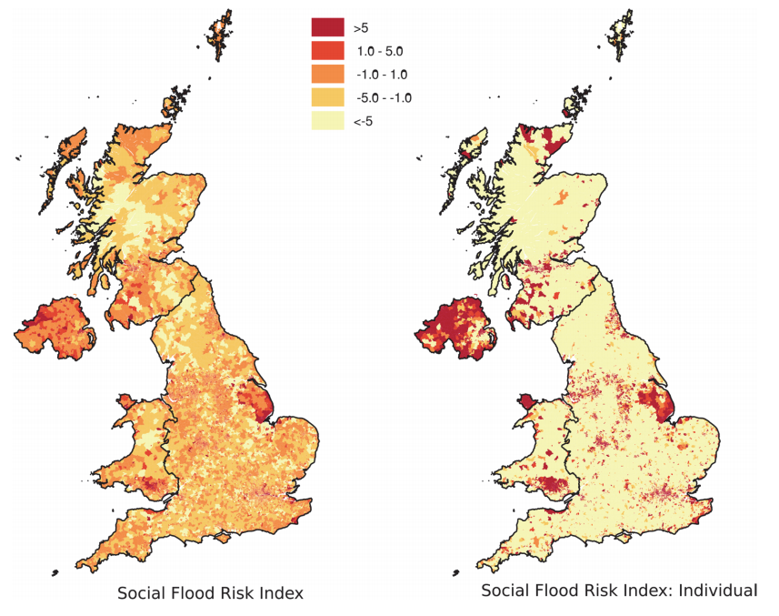
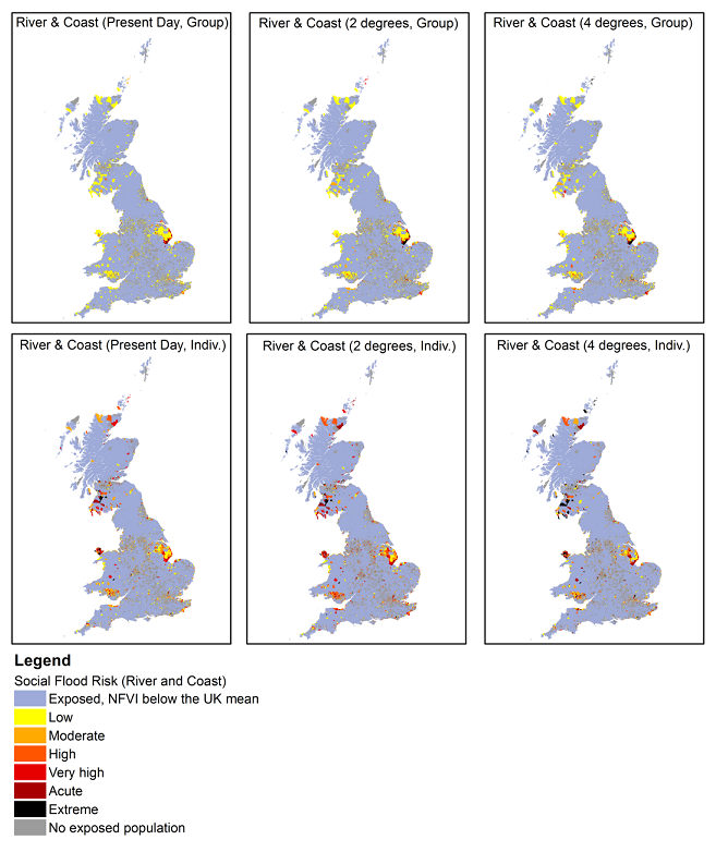
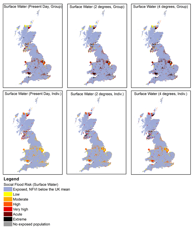
Figure 8c. SFRI for surface water flooding using the refined legend in the map tool
In some cases, flood disadvantage is highly localised, in others it is widespread. Flood disadvantage typically reflects areas where a large number of vulnerable people are exposed to flooding (such as in Hull). In such situations, conventional flood defences are more likely to be feasible (technically and economically). Elsewhere, however, flood disadvantage may be highly localised and reflect the exposure of a small number of vulnerable people to frequent flooding. When considered from this perspective, other areas emerge as experiencing high levels of disadvantage, such as West Somerset, for example, where highly localised (individual and community based) approaches may be needed to manage flood risks.
In most cases, local authorities that experience the highest level of flood disadvantage today continue to do so in the future. There are however several exceptions where the increase is much faster than elsewhere. Across the Highlands of Scotland, Cardiff, Enfield, North Somerset, Tower Hamlets and Haringey the rate of increase in SFRI is significantly higher than elsewhere. In these areas, the SFRI in the future is much greater than today.
Cities in decline and their influence on flood disadvantage
City regions in relative economic decline tend to experience levels of flood disadvantage above the UK average; suggesting flood risk could undermine economic growth in areas that need it most. Sixteen of the 24 cities classed as in relative decline experience levels of flood disadvantage above the UK average. This reflects a combination of influences but is driven by higher than average levels of vulnerability (as shown by the NFVI) and a greater than average number of people exposed to frequent flooding (in Glasgow, for example, those living in the floodplain are almost twice as likely to experience frequent flooding than the UK average). When income and insurance penetration are considered, the relative economic pain associated with flooding is significantly higher in these sixteen cities, reflecting the lower levels of income (on average) and lower levels of insurance. Belfast, Grimsby, Glasgow and Hull are all examples of struggling city-regions where the flood disadvantage is much higher than the UK average.
Recent developments in vulnerable neighbourhoods (England)
Recent developments (2008-14) in areas prone to frequent coastal and surface water flooding (1-in-75 years or more frequent) have disproportionally taken place in the most vulnerable neighbourhoods. Analysis by the Adaptation Sub-Committee (ASC) of new developments built between 2008 and 2014 found that floodplain development continues19. Further review of this analysis highlights that of the 1,199,000 new residential developments built in the period 2008-14, 225,000 (or 20%) were built in flood prone areas (across all sources) with one in four of those properties being built in the 20% most vulnerable neighbourhoods. Vulnerable neighbourhoods in coastal and surface water floodplains have experienced greatest disproportionality in development. For coastal floodplains and surface water prone areas, new properties are ~20% more likely to be in areas prone to more frequent flooding (1:75 or greater) for the 20% most vulnerable neighbourhoods than for all neighbourhoods.
By the 2080s all developments built between 2008 and 2014 will experience a significant increase in exposure to flooding. Across all sources of flooding the increase is greatest in those developments built in the most vulnerable neighbourhoods; a discrepancy that is most significant at the coast.
Long-term investment in England: Evidence for greater investment in vulnerable neighbourhoods
There is strong evidence to support improving the protection provided to the most vulnerable neighbourhoods. Reanalysis of the optimised investment scenario in England within the Long‐Term Investment Scenarios (LTIS) (used to support the case for investment in flood risk management20) highlights a long-term economic case for improving the protection afforded to vulnerable communities, suggesting there is both an economic and a social justice argument for improving protection. It is also clear that income (and consequently health) are important drivers of flood vulnerability and are directly influenced by broader welfare, social and economic policy. To enhance FRM outcomes, opportunities from broader policy areas will be required to address localised flood disadvantage. This will include recognising the linkage between green infrastructure responses, such as Sustainable Urban Drainage Systems (SUDS), and the wider health and wellbeing benefits they provide. It will also be increasingly important to recognise the role of planning/welfare or other social policy interventions play in either increasing or offsetting flood disadvantage (by putting more people into areas exposed to risk in the case of planning or increasing vulnerability through cuts to welfare benefits affecting incomes).
The combination of present-day vulnerability and future patterns of temperatures shows that extreme heat disadvantage is mainly associated with densely populated urban locations (London, Birmingham); to a lesser degree it affects the East of England, South East and South West. In the north of England, the projected increase in future temperatures is less extreme than in the south, resulting in less pronounced disadvantage to heat. Maps of the distributions of heat disadvantage, exposure to high temperatures and heat-related socio-spatial vulnerability are given in Figure 9. Look in more detail at the maps for your area in the map tool.
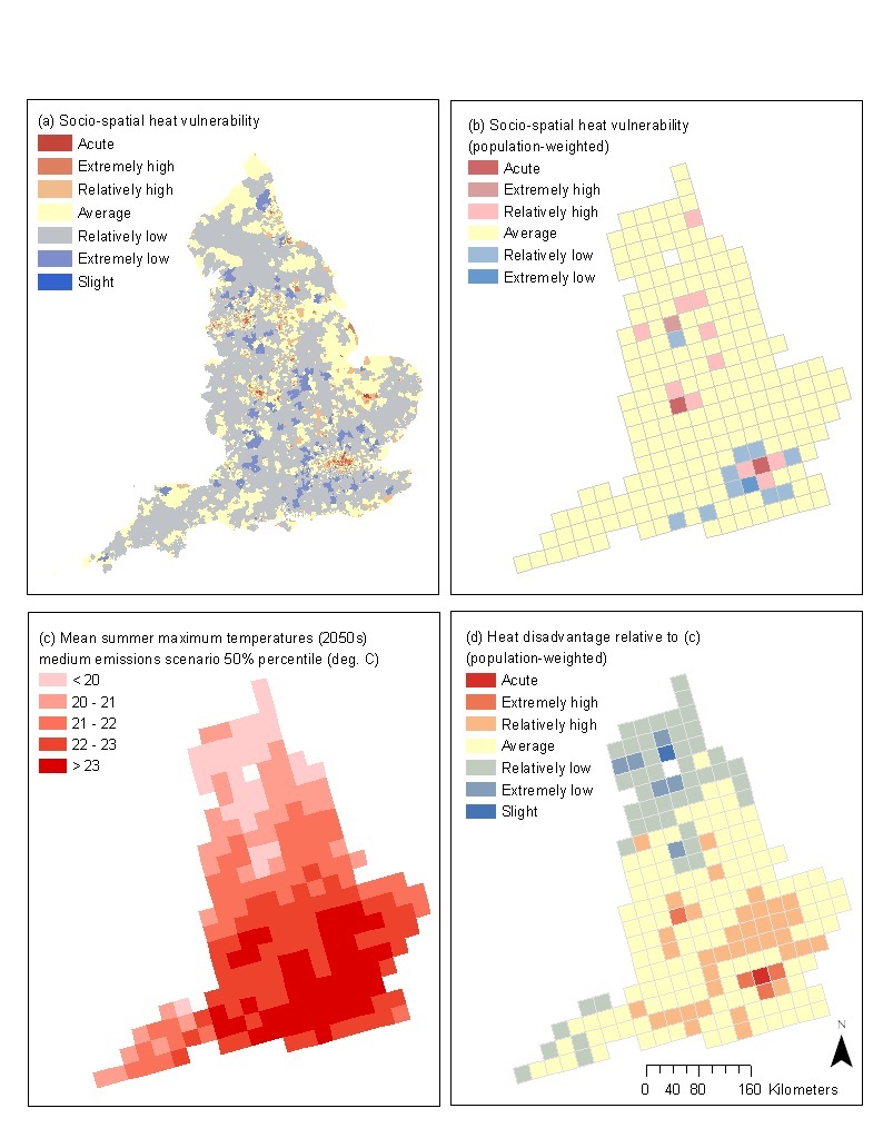
Figure 9: (a) Socio-spatial heat vulnerability in England: by neighbourhood (b), expressed as a population-weighted total (c), heat hazard-exposure measured as the medium emissions scenario 50% percentile mean summer maximum temperatures in the 2050s (d) and heat disadvantage relative to (c).
Around 9% of English neighbourhoods are extremely socially vulnerable with respect to heat which is similar to the proportion estimated for 2001. Due to changes in some of the indicators used in the index it is not possible to directly compare 2001 and 2011 with confidence.
London is the region with the highest proportion of its neighbourhoods estimated to be extremely socially vulnerable to heat, followed by the West Midlands and the North West (with high concentrations around Manchester and Birmingham). London neighbourhoods have the highest average (mean) socio-spatial heat vulnerability scores in England. Relative to the rest of England, almost 25% of all London neighbourhoods were highly socially vulnerable with respect to heat in 200115. This proportion has grown to 28% in 201116 (Figure 10). It represents getting on for half of all of England’s neighbourhoods estimated to be socially vulnerable with respect to heat (47%). Regions with the most neighbourhoods in the lowest socio-spatial heat vulnerability class are in the South East and East of England. However, this lower vulnerability is offset to some extent by the chance of seeing higher temperatures, relative to northern England, for example.
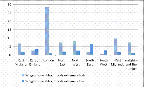
Figure 10: Proportions (%) of the total number of a region’s neighbourhoods estimated to have extremely high or extremely low social vulnerability with respect to heat.
It is well known that urban areas can exacerbate the impacts of events like heat-waves and flooding through the Urban Heat IsIand effect. The disproportionate effect of climate and weather events on urban residents is shown by higher heat mortality rates than in rural settings. However, it is important to recognise that some neighbourhoods are more prone to extreme effects than others and differences relate to individual, environment and social factors. There are uneven patterns of access to green spaces within cities so that some communities – for example with a large proportion of black and ethnic minorities or which are classified as deprived - are disproportionately associated with dense urban areas with little green space. There is also a connection between some vulnerable groups and certain types of housing and for that housing to be located in places where there is a higher chance of being affected, e.g. in older, terraced accommodation in valley bottoms. Analyses carried out for London have revealed that relatively high proportions of key social infrastructure associated with health and education – and therefore with key vulnerable groups - is located within areas which are susceptible to flooding.
Back to the top


